
Analytics
The Analytics tab provides visual insights into your MCP server’s traffic patterns and performance trends.
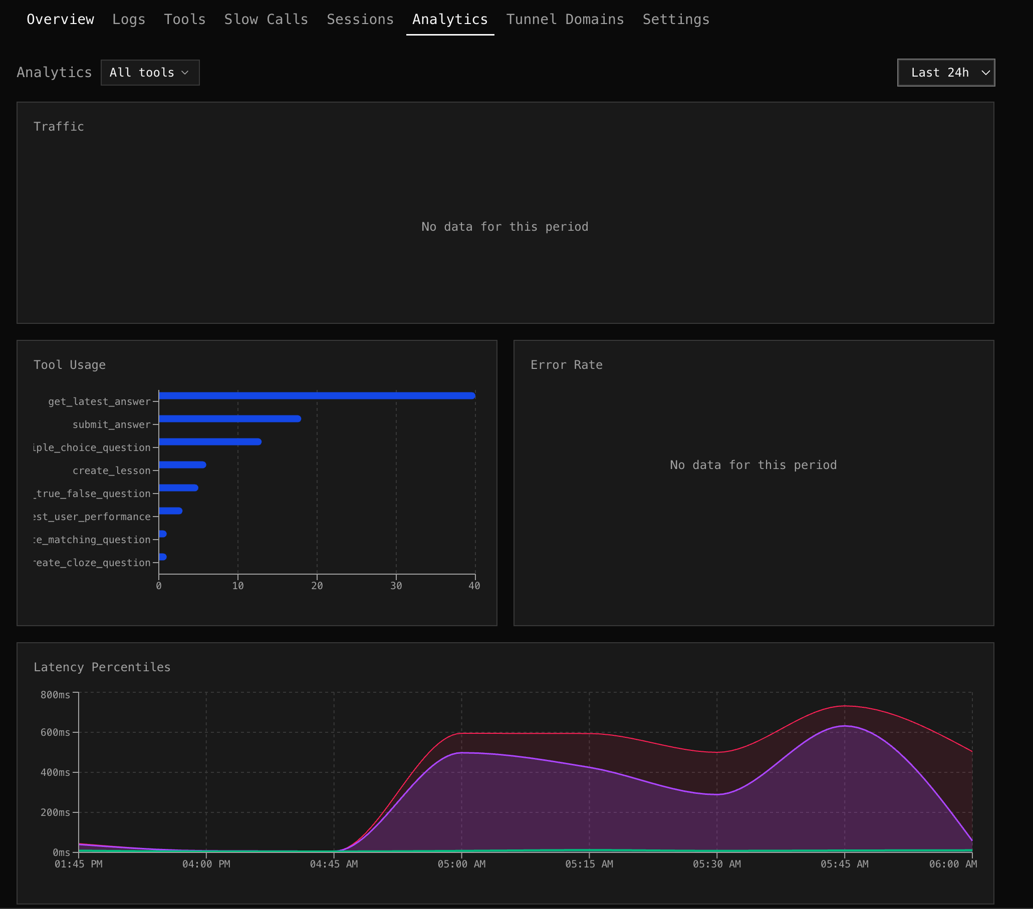
Traffic
Section titled “Traffic”A stacked area chart showing requests over time, broken down by type:
- Tool calls — actual MCP tool invocations
- Sessions — new session connections
- Errors — failed requests
Spot traffic spikes, correlate session starts with tool call volume, and see error bursts at a glance.
Tool Usage
Section titled “Tool Usage”A horizontal bar chart ranking tools by call count. Each bar shows total calls and errors side-by-side. Quickly identify which tools dominate traffic and which have the highest error counts.
Tool Filter
Section titled “Tool Filter”Use the tool multi-select dropdown to filter all charts to specific tools. Select “search_products” and “get_weather” to see only their traffic, errors, and latency.
Error Rate
Section titled “Error Rate”A line chart showing error percentage over time for tool calls. Correlate error spikes with deployments, traffic changes, or upstream outages.
Latency Percentiles
Section titled “Latency Percentiles”An area chart with three layers:
- p50 (green) — median response time
- p95 (amber) — 95th percentile
- p99 (red) — 99th percentile
When p99 diverges from p50, you have outlier requests. When p50 rises, your baseline performance is degrading.
Traffic by Client
Section titled “Traffic by Client”A stacked area chart showing request volume per AI client over time (top 5 clients). See if a specific client is driving a traffic spike, or if adoption is growing across all clients.
Time Range
Section titled “Time Range”All charts respect the selected time range. The bucket size adjusts automatically:
| Range | Bucket |
|---|---|
| 1h | 1 minute |
| 6h | 5 minutes |
| 24h | 15 minutes |
| 7d | 1 hour |
| 30d | 4 hours |